Twitter opens applications for its ‘prototype’ program, first tests to focus on fixing conversations
Twitter today is opening up applications for its new testing program, first announced at CES in January. The program potentially can cover any and every aspect of the Twitter experience, but the first set of tests will focus on how interactions between people, and specifically replies, appear on Twitter.
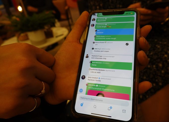
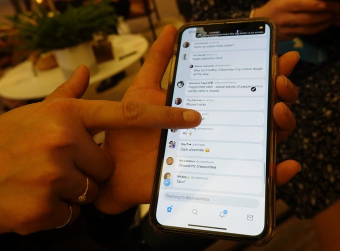
They will include a new design for replies to make it easier to follow a conversation; rounded shapes on reply tweets; indents to follow responses; hiding engagement and sharing behind a tap to bring out the content of replies; and introducing colors to add more context.
We got an early look at these features when we saw the “beta” app in January (which is now referred to as a prototype rather than beta effort); read on for more on all the features.
Improving the look and feel of how Twitter works is a tall order, to say the least. Many have pointed out, and the company now admits, that back-and-forth tweets are too hard to follow. Given that Twitter’s core premise is that of a platform for conversations, that not only limits the product’s usefulness, but it potentially puts off newcomers as well.
These issues recently came to a head when Twitter’s own CEO Jack Dorsey attempted to participate in a tweet-based interview with journalist Kara Swisher. As their conversation continued, Twitter’s failings on this front were on clear display. Despite the use of a public hashtag, people were confused as to how to track the reporter’s questions and @jack’s answers.
“This thread was hard,” Dorsey tweeted at the end of the interview. “Need to make this feel a lot more cohesive and easier to follow.”
While interviews with major tech execs aren’t an everyday occurrence on Twitter (yet?), longer conversations with threaded replies are, and they’ve perhaps become even more prevalent after Twitter doubled its character count from 140 to 280 in late 2017. That change allowed people to share their expanded thoughts with more nuance, which in turn prompted more thoughtful replies.
Around the same time, Twitter turned “tweetstorms” into an official product, allowing people to tweet out a series of connected thoughts, each which invite their own related series of responses.
With all these changes, tracking the growing amount of back-and-forth has become overly complex, especially when a conversation has a lot of participants.
That’s the problem the new testing program aims to better understand and eventually solve.
“It’s kind of a new take on our thinking about product development,” Sara Haider, Twitter’s director of product management, said in an interview in January. “One of the reasons why this is so critical for this particular feature is because we know we’re making changes that are pretty significant.”
Within a separate, standalone app, the company will roll out experiments that allow the Twitter community to more directly participate in the early development process. At launch, that means fixing conversations. But over time, Twitter aims to use this platform to try out new ideas before they make their way to the public product.
Fixing conversations could be one of the biggest changes to Twitter to date, she noted, which is why it’s critical for the company to get it right.
“We need you to be part of this process, so that we know we’re building the right experience,” Haider said.

Above: the development build at CES; the new product will look different, we’re told
Like the build TechCrunch previewed in January, the soon-to-launch Twitter prototype will feature an entirely new design for Replies where the conversations themselves have a rounded, more chat-like shape and are indented so they’re easier to follow. It won’t be the first time it has tried this, but softer edges, it seems, are thought to look more human.
The company isn’t yet sharing images, but says you can imagine the Replies look more like the chats you see in Direct Messages — that is, they’re more rounded, but not exactly speech bubbles.
Engagements, sharing options and other tweet details, meanwhile, will also get hidden from view to further simplify things. You will have to tap on the tweets in order to view them, Twitter says. Again, the aim here will be to put the focus more on what’s being said, not to act on it. This is actually an interesting shift, since so much in social media has been focused around engagement. Now, Twitter’s going to see if taking away some of those engagement nudges will, essentially, keep people around longer.

Above: Engagements are hidden on the development build seen at CES
Making conversations color-coded to highlight the tweets from the original poster as well as those tweets from people you follow is a straight play at giving more visual cues to the reader of a conversation.
“Reader” might be the operative word here. One of Twitter’s big issues with conversations is that they can be too noisy when too many people get involved. One solution to that might also be to try to think of how that might get limited, either so that only certain replies are seen (which is something that Twitter is already doing to some extent, by putting replies from people you follow at the top), or perhaps so that not all people can reply — an idea that the CEO himself has teased as a possibility. Both position Twitter as a reading-first, not engagement-first, experience, which is why making those replies easier to read is so important.
In the development build we saw last month, those colors were overly saturated for testing purposes. In the prototype, they’ve been dialed down. Now, people you follow will be in blue and the responses from the original poster are gray.
The reply highlighting is now just a shadow line along the reply, as opposed to the entire reply being colored, Twitter tells us.
The company says it will only accept a couple of thousand testers into the program. But unlike many beta programs, which are closed, testers aren’t under NDA. Instead, they’re encouraged to tweet about the test and discuss the changes with the broader Twitter community so more people can weigh in with their thoughts.
In addition, testers will be able to submit feedback through a closed form or they can just tweet to Twitter’s teams.
The tweet-and-reply system has been a thorn in Twitter’s side for years. Because Twitter was originally designed as a short-form, SMS-like platform, it never anticipated how it would evolve into the discussion platform it has become today.
The company has tried in vain to figure out how to simplify things for users for years. For example, it added connecting lines between tweets and responses, made @usernames in replies a part of the tweet’s metadata and even changed the Reply icon itself. Recently, it added an “original tweeter” badge to conversation threads, too.
The company says it will mostly invite English and Japanese speakers to the testing program. Participants must follow the Twitter Rules to be invited. However, they don’t necessarily need to be longtime Twitter users. In fact, the company tells TechCrunch it aims to have a range of people involved, from those who don’t use Twitter often to those who use it consistently.
Those interested in applying to the program can do so from the tweet posted by the @TwitterSupport account or can use this link. If accepted, users will receive an email informing them of the next steps.
✍ Source : ☕ Social – TechCrunch
To continue reading click link or copy to web server. :
(✿◠‿◠)✌ Mukah Pages : 👍 Making Social Media Marketing Make Easy Through Internet Auto-Post System. Enjoy reading and don't forget to 👍 Like & 💕 Share!


Post a Comment