A first look at Twitter’s new beta app and its bid to remain ‘valuable and relevant’
Twitter has made a name for itself, at its most basic level, as a platform that gives everyone who uses it a voice. But as it has grown, that unique selling point has set Twitter up for as many challenges — harassment, confusing way to manage conversations — as it has opportunities — the best place to see in real time how the public reacts to something, be it a TV show, a political uprising, or a hurricane.
Now, to fix some of the challenges, the company is going to eat its own dogfood (birdfood?) when it comes to having a voice.
In the coming weeks, it’s going to launch a new beta program, where a select group of users will get access to features, by way of a standalone app, to use and talk about new features with others. Twitter, in turn, will use data that it picks up from that usage and chatter to decide how and if to turn those tests into full-blown product features for the rest of its user base.
 We sat down with Sara Haider, Twitter’s director of product management, to take a closer look at the new app and what features Twitter will be testing in it (and what it won’t), now and in the future.
The company today already runs an Experiments Program for testing, as well as other tests, for example to curb abusive behavior, to figure out how to help the service run more smoothly. This new beta program will operate differently.
While there will only be around a couple thousand participants, those accepted will not be under NDA (unlike the Experiments Program). That means they can publicly discuss and tweet about the new features, allowing the wider Twitter community to comment and ask questions.
And unlike traditional betas, where users test nearly completed features before a public launch, the feedback from the beta could radically change the direction of what’s being built. Or, in some cases, what’s not.
“Unlike a traditional beta that is the last step before launch, we’re bringing people in super early,” Haider said.
The first version of the beta will focus on a new design for the way conversation threads work on Twitter. This includes a different color scheme, and visual cues to highlight important replies.
“It’s kind of a new take on our thinking about product development,” explains Haider. “One of the reasons why this is so critical for this particular feature is because we know we’re making changes that are pretty significant.”
She says changes of this scale shouldn’t just be dropped on users one day.
“We need you to be part of this process, so that we know we’re building the right experience,” Haider says.
Once accepted into the beta program, users will download a separate beta app – something that Twitter isn’t sure will always be the case. It’s unclear if that process will create too much friction, the company says, so it will see how testers respond.
Here are some of the more interesting features we talked and saw getting tested in the beta we were shown:
Color-coded replies
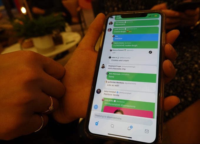
During the first beta, participants will try out new conversation features which offer color-coded replies to differentiate between responses from the original poster of the tweet, those from people you follow, and those from people you don’t follow.
In a development build of the beta app, Haider showed us what this looked like, with the caveat that the color scheme being used has been intentionally made to be overly saturated – it will be dialed down when the features launch to testers.

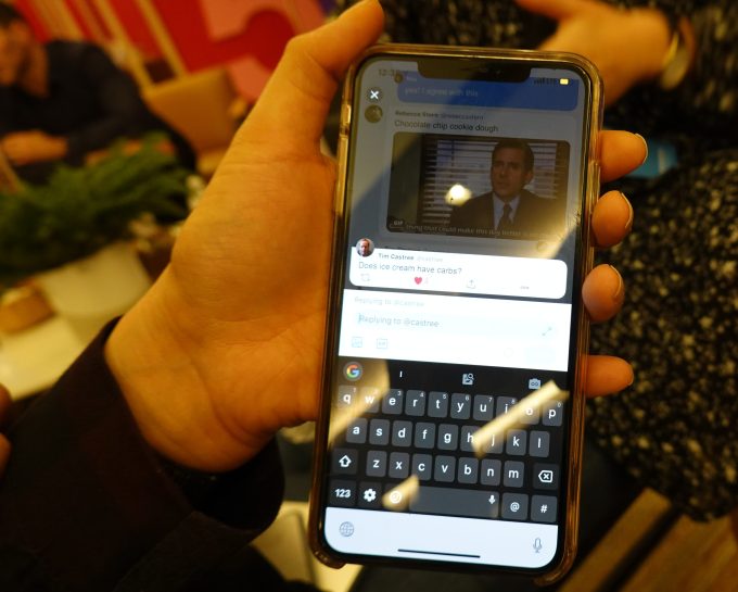
When you click into a conversation thread, the beta app will also offer visual cues to help you better find the parts of the thread that are of interest to you.
One way it’s doing so is by highlighting the replies in a thread that were written by people you follow on Twitter. Another change is that the person who posted the original tweet will also have their own replies in the thread highlighted.
In the build Haider showed us, replies from people she followed were shown in green, those from non-followers were blue, and her own replies were blue.
Algorithmically sorted responses
One of the big themes in Twitter’s user experience for power and more casual users is that they come up with workarounds for certain features that Twitter does not offer.
Take reading through long threads that may have some interesting detail that you would like to come back to later, or that branches off at some point that you’d like to follow after reading through everything else. Haider says she marks replies she’s seen with a heart to keep her place. Other people use Twitter’s “Tweets & Replies” section to find out when the original poster had replied within the thread, since it’s hard to find those replies when just scrolling down.
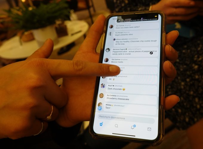
Now, the same kind of algorithmic sorting that Twitter has applied to your main timeline might start to make its way to your replies. These may also now be shown in a ranked order, so the important ones — like those from your Twitter friends — are moved to the top.
A later test may involve a version of Twitter’s Highlights, summaries of what it deems important, coming to longer threads, Haider said.
The time-based view is not going to completely leave, however. “The buzz, that feeling and that vibe [of live activity] that is something that we never want to lose,” CEO and co-founder Jack Dorsey said last week on stage at CES. “Not everyone will be in the moment at the exact same time, but when you are, it’s an electrifying feeling…. Anything we can do to make a feeling of something much larger than yourself [we should].”
Removing hearts + other engagement icons
Another experiment Twitter is looking at is what it should do with its engagement buttons to streamline the look of replies for users. The build that we saw did not have any hearts to favorite/like Tweets, nor any icons for retweets or replies, when the Tweets came in the form of replies to another Tweet.

The icons and features didn’t completely disappear, but they would only appear when you tapped on a specific post. The basic idea seems to be: engagement for those who want it, a more simplified view for those who do not.

The heart icon has been a subject of speculation for some time now. Last year, the company told us that it was considering removing it, as part of an overall effort to improve the quality of conversation. This could be an example of how Twitter might implement just that.
Twitter may also test other things like icebreakers (pinned tweets designed to start conversations), and a status update field (i.e. your availability, location, or what you are doing, as on IM).

The status test, in fact, points to a bigger shift we may see in how Twitter as a whole is used, especially by those who come to the platform around a specific event.
One of the biggest laments has been that on-boarding on the app — the experience for those who are coming to Twitter for the first time — continues to be confusing. Twitter admits as much itself, and so — as with its recent deal with the NBA to provide a unique Twitter experience around a specific game — it will be making more tweaks and tests to figure out how to move Twitter on from being fundamentally focused around the people you follow.
“We have some work to do to make it easier to discover,” Dorsey said, adding that right now the platform is “more about people than interests.”
While all products need to evolve over time, Twitter in particular seems a bit obsessed with continually changing the basic mechanics of how its app operates.
It seems that there are at least a couple of reasons for that. One is that, although the service continues to see some growth in its daily active users, its monthly active users globally have been either flat, in decline, or growing by a mere two percent in the last four quarters (and in decline in the last three of the four quarters in the key market of the US).
That underscores how the company still has some work to do to keep people engaged.
The other is that change and responsiveness seem to be the essence of how Twitter wants to position itself these days. Last week, Dorsey noted that Twitter itself didn’t invent most of the ways that the platform gets used today. (The “RT” (retweet), which is now a button in the app; the hashtag; tweetstorms; expanded tweets, and even the now-ubiquitous @mention are all examples of features that weren’t created originally by Twitter, but added in based around how the app was used.)
“We want to continue our power of observation and learning… what people want Twitter to be and how to use it,” Dorsey said. “It allows us to be valuable and relevant.”
While these continual changes can sometimes make things more confusing, the beta program could potentially head off any design mistakes, uncover issues Twitter itself may have missed, and help Twitter harness that sort of viral development in a more focused way.
✍ Source : ☕ Social – TechCrunch
To continue reading click link or copy to web server. :
(✿◠‿◠)✌ Mukah Pages : 👍 Making Social Media Marketing Make Easy Through Internet Auto-Post System. Enjoy reading and don't forget to 👍 Like & 💕 Share!


Post a Comment