Facebook’s Bookmarks menu gets a facelift that makes its settings easier to find
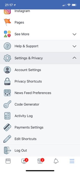
Facebook is rolling out a redesigned bookmarks section in its app that will make it easier to navigate and access various Facebook settings – including Account Settings, Privacy Shortcuts, News Feed Preferences, Activity Log, Payments Settings, access to Help & Support, and more. None of the options in the updated menu are new to Facebook. Instead, the changes are focused on centralizing a variety of controls that were previously located in other places, where they may have been unknown to some users.
The updated menu, at first glance, appeared to be a continuation of the redesign to Facebook’s Settings, announced last month.
At the time, the company promised a revamped settings menu on mobile that moves settings from across 20 different screens to a single place. It also launched the menu item “Privacy Shortcuts,” where you can lock down who can view your profile or contact you as well as learn about how to protect your privacy on its social network.
However, Facebook tells us this redesign was not related to the earlier announcement, but has been in the works for a while.
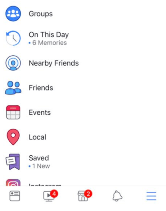
Now the entire Bookmarks menu is getting a makeover, where controls aren’t just centralized, but some have moved to the forefront instead of being buried behind an extra click.

The Bookmarks menu has also been given a new look and updated icons. While most of the list remains colorful, all the Settings Bookmarks appear in shades of gray to differentiate them.
Facebook confirmed the change to the Bookmarks section has begun to roll out to new users worldwide as part of a staged rollout.
“We’ve been looking into how to make Bookmarks easier to navigate and more relevant for people for some time,” a Facebook spokesperson told TechCrunch. “We hope this update, similar to the ones we’ve been making recently, will help people navigate Facebook more easily so they can continue to connect with the people, Pages and Groups they log on to see.”

The redesign comes at a time when Facebook is being heavily scrutinized over its data privacy protections for users, which has led to changes in other areas of its business as well – including its API (app) platform, apps’ access to user data, data portability and more. It had already acknowledged that some of its controls were too hard to find in the past, and it needed to correct that.
The new look for Bookmarks will be scaled to all users globally across all platforms over the next two weeks, Facebook told us.
✍ Sumber Pautan : ☕ Social – TechCrunch
Kredit kepada pemilik laman asal dan sekira berminat untuk meneruskan bacaan sila klik link atau copy paste ke web server : https://ift.tt/2IVu8aO
(✿◠‿◠)✌ Mukah Pages : Pautan Viral Media Sensasi Tanpa Henti. Memuat-naik beraneka jenis artikel menarik setiap detik tanpa henti dari pelbagai sumber. Selamat membaca dan jangan lupa untuk 👍 Like & 💕 Share di media sosial anda!


Post a Comment